Winery Website Design 101:
Expert design tips to sell more wine.
Key Takeaways:
WEBINAR SERIES
1. Clean & User-Friendly Design
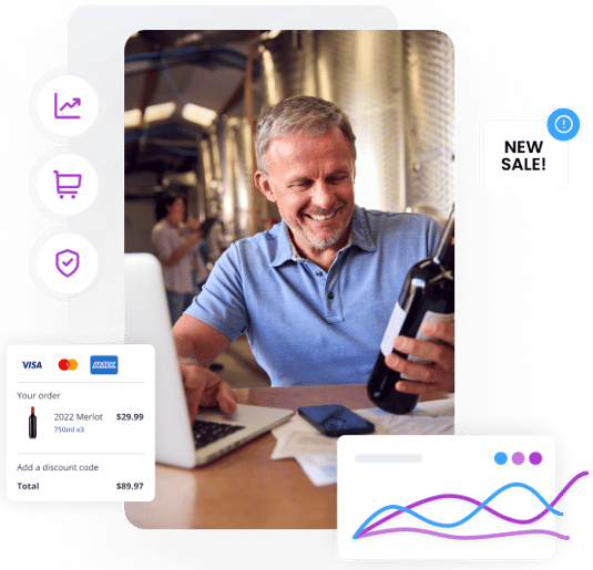
Simplify your website with an uncluttered layout, easy-to-read fonts, and clear messaging. Utilize color theory and visual hierarchy to prioritize key elements and guide user attention. Ensure a seamless experience across all devices with responsive, mobile-first design.
-1.png?width=579&height=533&name=Web%20Builder%20(2)-1.png)
2. High-Quality Visuals & Compelling CTAs
Use professional, high-resolution images and videos to showcase products effectively. Incorporate clear and compelling calls-to-action with strategic placement and contrasting colors. Maintain consistent product image quality to enhance your listings and sell more wine.

3. Building Trust & Easy Navigation
Boost credibility with customer reviews, testimonials, and secure payment badges. Design an intuitive menu structure with clear labels for effortless navigation. Maintain cohesive branding across all pages for a professional and trustworthy online presence.
Interactive Q&A Session
Prepare your questions for an interactive Q&A session where you can seek advice and clarifications on winery website design tailored to your business.
Meet the Experts:
WEBINAR HOSTS
Transform your winery website into a powerful sales tool with "Winery Website 101: Expert Design Tips to Sell More Wine." Learn to create a clean, responsive design that enhances user experience and drives conversions with high-quality visuals, compelling calls-to-action, and consistent branding. Join us to master essential design principles and elevate your online presence.
Can't make it? No problem.
Our webinars are recorded and made available online. Just register below & we'll email you the webinar recording for on-demand viewing.





.png)


.png)
